This series on the Pooky blog looks at the seven elements of interior design: space, texture, line, form, shape, colour, pattern, and, of course, light. In this post we look at colour, and how selecting colours for interior design is the ultimate mix of science and art…
“Colour is to room what light is to day - and is both the most noticeable and the most malleable element in decorating.” So said Mary Gilliatt, the late, great international interior designer and writer.
Using colour in our homes involves a seamless blend of art and science. In this post we’re going to look at the way colour works in terms of space, mood, and, of course, lighting.
Understanding colour in interior design: step by step
Given the fundamental importance of colour in our homes, choosing what is going to work best, whether we’re being led by heart or head, is possibly the decorating decision that causes the most anxiety.
Just think of all those tiny pots of paint colour samples we play around with before we make a final decision—then hope and pray that we’ve made the right choice. But there are some basic principles you can apply, and rely upon, that can help. Here’s a step-by-step guide…
Step 1: Understand the colour wheel - and how to combine colours

Moses Harris, ‘The Natural System of Colours’ and Ignaz Schiffermüller ‘Versucheines Farbensystems’ (Vienna, 1772), plate I. Image: Public domain
A colour wheel is a circular diagram that represents the colours of the visible spectrum and their relationships to one another, and you can use one to deepen your understanding of how colours work and how to combine them effectively.
Artists have been using colour wheels for centuries, and interior designers have taken up the concept. (Some colour wheels, like the one from 1772 above, make rather fine works of art in their own right.)
The three primary colours (red, blue and yellow) are equidistant from one another on the wheel and secondary and tertiary colours sit between them.
There are three principal approaches to combining colours, each producing a different effect:
- Tonal colours – combine multiple tones of a single colour to create a harmonious feel
- Analogous colours – use colours that are near each other on the colour wheel to create a serene, calm mood. Examples would be using greens, blue-green and blues.
- Complementary colours – these are two colours that sit directly across from each other on the colour wheel. When combined they will complement each other but also provide pleasing contrast. Classic complementary colour combinations include red with green and blue with yellow.
A gorgeous use of green-red complementary colours by Lonika Chande. Image: Lonika Chande
Step 2: Understand colour, warmth and mood
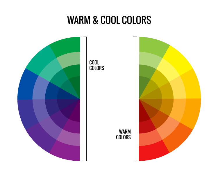
Image: Lacie Lynnae via creative commons
We all know that different colours can conjure up different emotions and moods, so it makes sense to apply at least some of the principles of colour psychology when choosing colour schemes for particular rooms. Neutral tones create a relaxing atmosphere, as do soft pastels, while bold strong colours can make you feel energetic.
Colours can also be warm or cool. Tones close to the blue spectrum, such as dark greens and navies, are cooler and have a calming effect, whereas colours close to the red spectrum, including reds, yellow, oranges and pinks, are warmer and bring a sense of vibrancy and cheer.
There are practical implications of colour and mood. A good night’s sleep depends on many factors, including the predominant colours in your bedroom. Opt for a soothing and relaxing look, with soft blue, pale pink or lavender, particularly if you have difficulty getting to sleep.
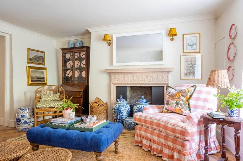
However, you might want a complete contrast in your sitting room; if you want to emphasise comfort, and a sense of welcome and conviviality, go for rich, warm colours. Add accent colours for intensity and a touch of lightness with white woodwork. Or for a restful, calm sitting room, a neutral palette works well; add a statement piece in a strong colour, for contrast and interest.

A beautifully understated mix of neutrals, warm terracottas and cool greens in the home of Lee Thornley, founder of Bert & May - including a trio of Pooky's Pumpkin pendant lights. Photo: Beth Davis
Step 3: Become a colour collector
By being open to noticing colours and combinations wherever you find them, whether indoors or outdoors, you can become much more aware of your own colour preferences. Phone cameras make it easy to build a record of what catches your eye.
You may already have strong colour inclinations – a firm yes to terracotta, but no to orange, perhaps? But becoming more conscious of the colours that surround us can make us look at familiar colours in different ways. You might not be a fan of scarlet but what about a blush rose, at the pinkish end of red?
The interior designer Sean Symington is a fabulous collector of colours, instinctively putting all sorts of surprising colours together - and it all works! Image: Sean Symington
Using three colours: the 60:30:10 rule
There is a time-honoured rule in interior design for creating a balanced look in a room using colours in proportion. It’s very simple: you choose three colours and use them in an approximate ratio of 60:30:10.
So 60% of the room will be the main base colour, 30% is a complementary second colour and the remaining 10% is a bolder accent colour, which gives the look visual interest.
In a classic 60:30:10 sitting room, for example, the main 60% colour (very often a neutral) will cover the ceiling and walls, and the secondary 30% colour might be the sofa, a rug and the curtains. Finally, bold colour ‘pops’ from lampshades or cushions might make up the final 10%.

An unusual take on the 60:30:10 rule using black, natural oak, and white in this kitchen by Naked Kitchens (featuring Pooky's Ramesses lantern)
If you browse interiors accounts in magazines or on Instagram, you’ll see this formula being used over and again. And although as a rule it can be broken (see below), if you follow it you really can’t go too far wrong.
Using colour in different spaces

A limited colour palette can be highly effective in a small space; sitting room by Toby Perryman-Payne @tobyshome.
If you have a large home, you have the space needed to play around with a generous colour palette and completely different colour choices for different rooms. If, however, you’re trying to make the most of a small home with limited space, it’s wise to decide on a particular palette and apply your colour choice in varying degrees. This approach creates a sense of harmony and flow and makes the most of the space you have.
Here are just some of the ways that you can use colour to manipulate space…
- To make a room look bigger: Opt for cool, light colours instead and use the same colour on all the walls. Avoid strong, deep colours like red, unless you’re deliberately creating a cosy nook in a small space.
- To make a long narrow corridor feel more spacious: Apply a warm colour to the end wall.
- To make a high ceiling look lower: Create the illusion by painting it a darker colour than the walls. Alternatively, add a dado rail at waist-high level, with a darker colour below the rail and a lighter colour above.
- To make a low ceiling look higher: And the reverse is true if you want a low ceiling to appear higher than it actually is—opt for a lighter colour than the walls.
Deeper into colour - five more colour tips to inspire you
1) Experiment with light and colour

The colours in this dining area, which features Pooky’s seven-tiered Galactica chandelier, work well in either natural and artificial light.
Light, whether natural or artificial, will affect all and every colour, so if you are at the testing stage, make sure that you take a good look at how different colour choices appear according to the time of day. This applies whether you are decorating a large, light, airy room with big windows, or a small area with very little natural light.
2) Break the three colour rule with multiple accent colours
Rules are useful, but you can bend or even break the rules if you go about it in the right way, as we explain in this post. If you’re a lover of colours, plural, but are worried about overdoing it, one time-honoured approach is to limit the number of colours for main areas—walls, floors, and windows—to three but add a multiplicity of accent colours with accessories. Ali Attenborough, founder of The Style Counsel, shows the way in this sitting room.

Ali Attenborough's set for Sofology, featuring multiple accent colours. Photo: Max Attenborough
3) Let the design style pick the colour for you
If your starting point is a particular interior design style, then part of the work is done for you, as specific styles tend to be associated with particular colours. Take Art Deco…black and white and metallic colours probably spring to mind, but it was also a style that incorporated rich greens and golds. Arts & Crafts is all rich natural greens and browns and pattern, while modernism goes for whites and greys with the odd bold primary colour.
4) Go for monochrome – or black and white?
Black and white are colours too, and a strict black/white scheme can be stunningly effective. But contrary to popular belief, ‘monochrome’ doesn’t necessarily mean black and white – rather it means ‘one colour’, which could be red, yellow or anything else.
Truly monochrome rooms in non-neutral colours are a rarity in ordinary home decor, but there is a history of spectacular single-colour interior design in large houses and stately homes. Check out Jackie Kennedy’s Red Room at the White House, for example.
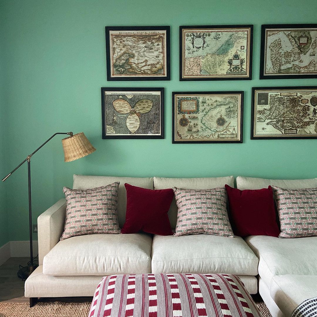
5) Break the blue and green rule
At Pooky we’ve known for years that the old adage that “blue and green should never be seen” is just plain wrong (and we were pleased that Country Life agreed with us). Here’s the proof:
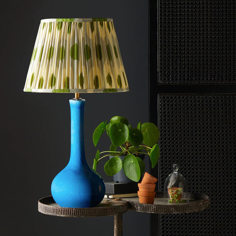
Ellie table lamp in turquoise with grey green egg and spoon ikat shade
Using lighting to bring colour into your decor

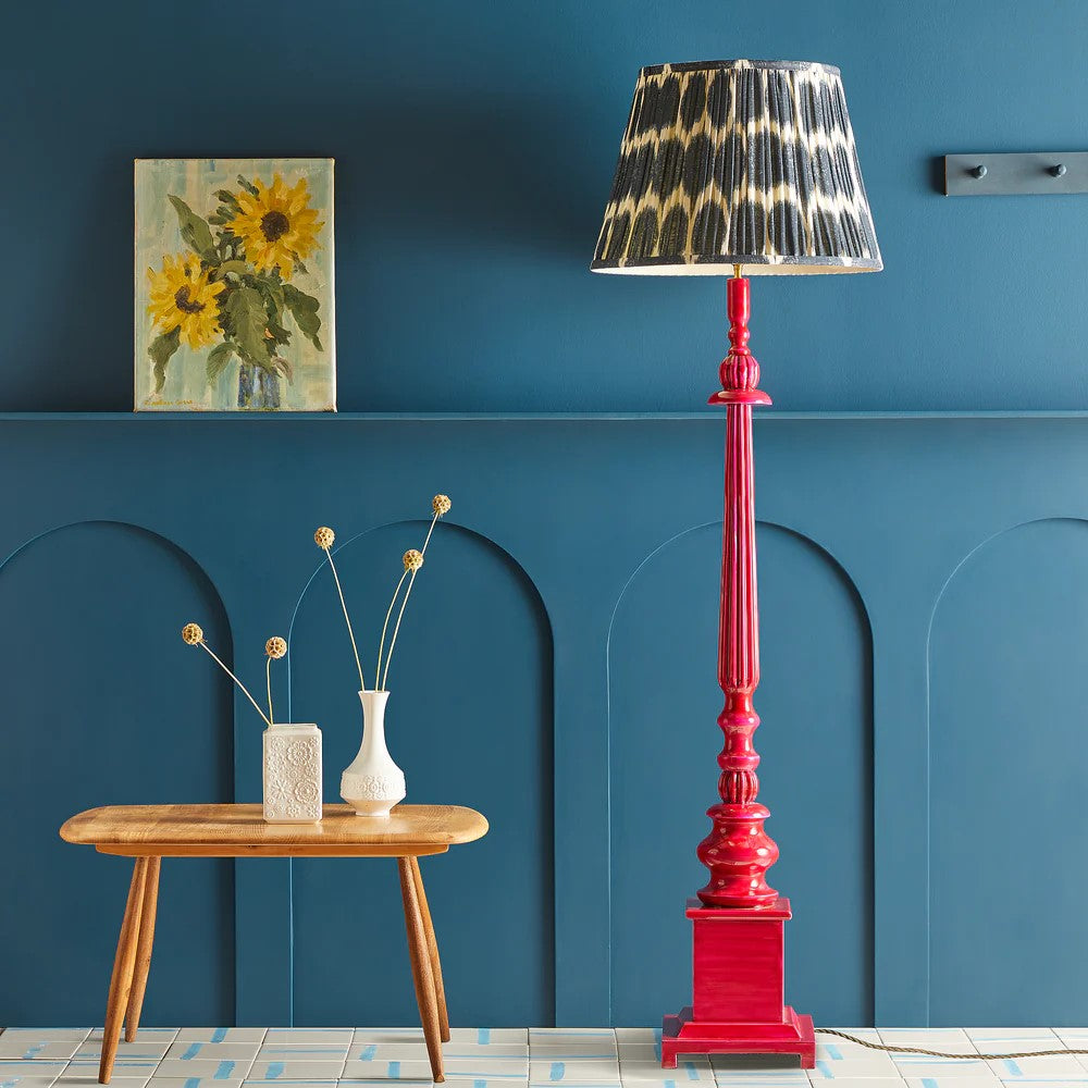
Tabby table lamp in vermilion with calendula chalk stripes shade
Lamps and shades are a wonderfully simple way to bring in colour to a space: whether to complement the main colours or bring in accent pops.
As well as size, shape, material, style, pattern and fitting type, you can also search Pooky lampshades and table lamps by colour, so if you’re looking for a green table lamp or a deep red lampshade to complete your scheme, it’s very easy to narrow down the options.
We offer wooden table lamp bases in a range of twenty Little Greene paint colours, and even floor lamps can be eye-popping, such as the Dorian in Cosmo pink…
Dorian floor lamp in cosmo pink
Pooky makes beautiful, affordable designer lighting for beautiful rooms. Browse our full range of lamps, shades and more.
See also:
The Seven Elements of Interior Design: Space
The Seven Elements of Interior Design: Texture
The Seven elements of interior design: Line
The colour theories series:
Colour theories in interior design and lighting: black
Colour theories in interior design and lighting: white
Colour theories in interior design and lighting: red
Colour theories in interior design and lighting: blue
Colour theories in interior design and lighting: green
Colour theories in interior design and lighting: yellow
Colour theories in interior design and lighting: orange
Colour theories in interior design and lighting: pink