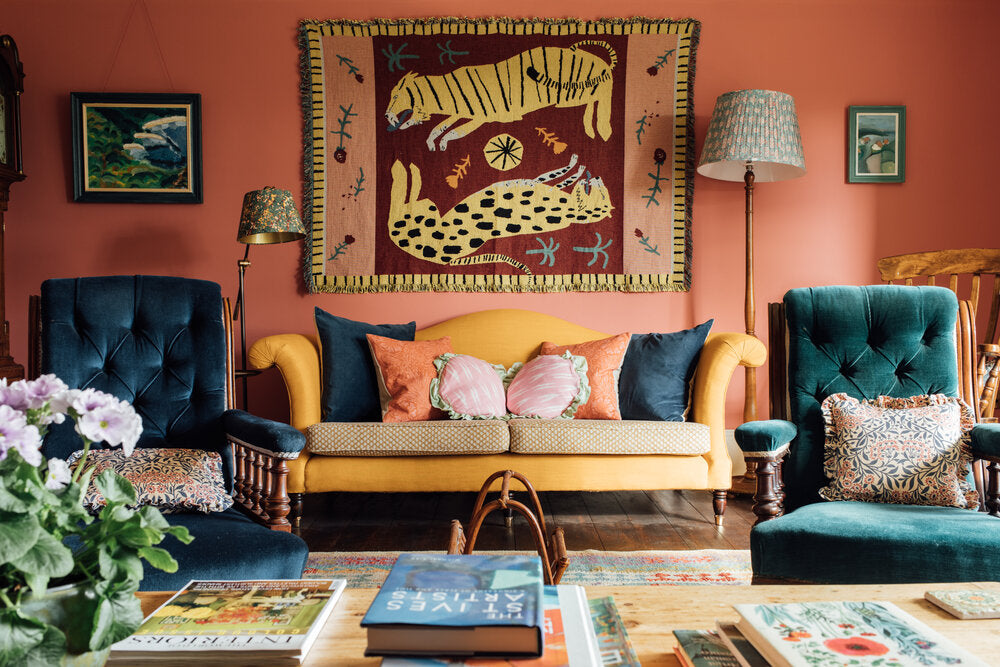
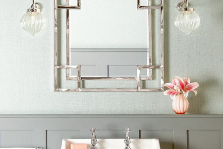
Does it really matter if your curtains don’t match your lampshades? And is using dark colours in a small room always a no-no? We all know that rules were made to be broken – the trick is to break them in the right way…
Convention #1: Choose things that match
Matching colours, materials, styles and finishes… All of these things can help to create a lovely space, with a sense of balance and symmetry. But go too matchy-matchy and you’ll lose…character.
Recently we’ve seen a big shift in design trends towards a brave, fun, maximalist approach, which celebrates different colours, patterns, styles and textures. It makes for a visual feast, and can actually give your home a natural, organic feel.
How to break the rules
Of course, there’s a certain art to mixing and matching. It’s important to think about how your choices will work with the rest of your space, and the kind of overall look you want to achieve. It’s also a good idea to include some common elements to help tie everything together. So for example, if you’re combining different patterns try to keep to a similar underlying colour theme, or if you’re mixing different styles stick to similar materials, and so on.
Changing up your lampshades is an easy and effective way of mixing things up a bit, without breaking the bank or doing any DIY.
Another good lighting mix-and-match trick is to have several table or floor lamp bases in the same style and material but with contrasting shades – or do it the other way around: use the same style and shape shade on wildly different bases.
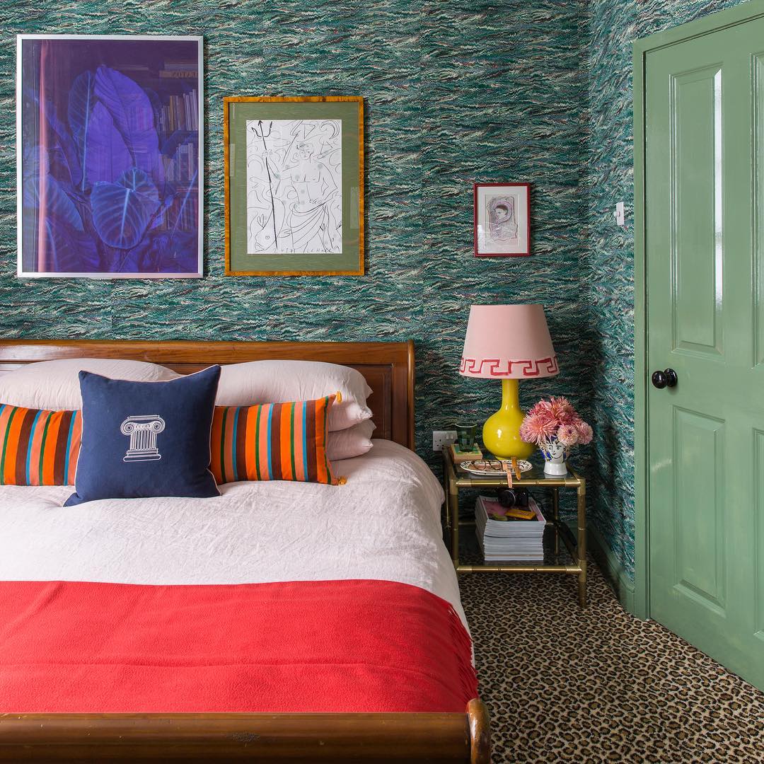 A fabulous array of colours, textures and patterns in this bedroom by Luke Edward Hall. Nothing really matches, yet everything really works. Image: Luke Edward Hall
Convention #2: Be consistent with period style
Another fixed idea people sometimes have is that you shouldn’t mix old and new styles, for fear of looking a bit weird or having some jarring contrasts, like an inherited oak dining table surrounded by modernist plastic chairs. But sticking to one period or style can lead to a slightly one-dimensional feel; and while you don’t want your space to look confused, you don’t want it to feel like a museum either.
How to break the rules
Introducing some vintage or antique furniture can instantly add interest to a modern or neutral setting. If in doubt, stick with a few choice pieces which sit comfortably with each other and within the wider space.
For a lovely focal point, try pairing a beautiful vintage armchair with a gorgeous Arts & Crafts style table lamp, and then adding in some accessories such as cushions or throws, for additional colour and texture. Meanwhile, in a more traditional setting, you can make a real style statement with a striking contemporary floor lamp and shade.
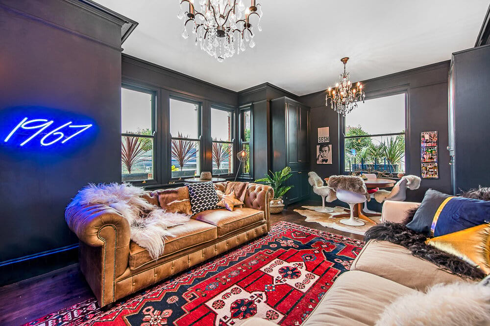
Claire Botha of Geek Vintique is famous for fearlessly mixing up colours, periods and styles, with glorious results. Photo: @geekvintique
Convention #3: Base everything on neutrals
The great thing about white and neutral colour schemes is they’re very versatile, and they work very effectively as a backdrop for a room. Basing your scheme on neutrals (walls, floor and ceiling) and then adding in warmth and colour with furniture and rugs, plus bolder colour pops via accessories like lampshades and cushions is indeed a very sound and reliable interior design convention… But even it can be broken!
How to break the rules
It requires bravery, but some of the most fabulous rooms we’ve seen turn this conventional wisdom on its head and use bold colours – from rich greens to vivid pinks – as the main backdrop, with whites used as ‘neutral pops’ or even absent completely.
For inspiration, check out our recent Instagram discovery @emilydobbsinteriors – sensational!...
Convention #4: Avoid using dark colours in a small space
Neutral colours can certainly help to create the illusion of space and make things feel lighter and more airy – but it doesn’t follow that painting a small room white will necessarily make it look big, or conversely that introducing some colour will make it look smaller and more confined. Other factors are also important, such as the layout of the room, the height of the ceilings, and the amount of available natural light, and in fact adding in some colour can actually add a sense of depth to a small space.
How to break the rules
A well-established way to introduce colour into a small space is via a single feature wall with a bold colour or a patterned wallpaper… But you can actually really embrace your space and create a cosy cocoon by using a rich colour on all four walls and installing some beautiful mirrors and wall lights to lift the space and give it extra vibrancy.
And don’t forget the ceiling – in a small room with a high ceiling, painting the ceiling a darker colour can help to draw the eye upwards and emphasise the vertical space. Finish the look with an eye-catching pendant light and chandelier.
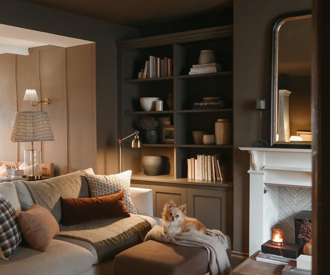
This beautiful, cosy room by Toby Perryman-Payne embraces the space with dark colours lifted by mirrors and lights. Photo: @tobyshome
Convention #5: Don’t mess with scale
Scale is another area where the traditional advice is to keep everything the same. Of course, you need the individual elements to work together in the space, but there’s no reason why you can’t have some fun experimenting with size and scale to create a space that’s interesting, inviting and full of personality. Playing with scale can make a small space feel larger, or a large space feel more cosy, and with some carefully chosen items you can really make an impact.
How to break the rules
It's easy to fall into the trap of thinking a small room should feature small-scale furniture, but in fact this can actually make it feel even more compact. Instead, it’s better to choose a few key pieces and go as large as you can...When it comes to lighting and accessories, a giant artwork or an oversized floor lamp will create a conversation-starting focal point.
And in an open plan space a large chandelier or pendant will help to define the space. Just make sure you hang it long and low...
Too big for the space? Not a bit of it! A large chandelier like Pooky's mighty seven tiered Galactica chandelier in mercurised glass can tie a room together.
We love seeing Pooky customers use our lamps and shades to express their personality and create beautiful and very individual spaces. Find more lighting inspiration on our blog and have fun browsing, mixing and matching from our vast range of lighting and accessories here.
See also:
5 archive print lampshades to give your home the maximalist Arts & Crafts look
Mixing and matching lampshades for visual impact: 7 interior design tips
Interior design: How to use lighting to make a room look bigger
An interior design lover’s guide to Ikat lampshades
Photo top: Glebe House. Interior design by Studio Alexandra. Photo by Finn Studio.


