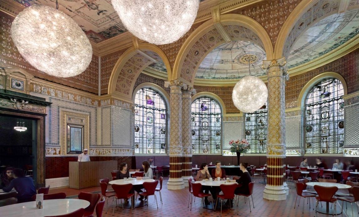
The three refreshment rooms at the Victoria & Albert Museum are a wonder of British Victorian interior design – and they put all other ‘caffs’ in the shade…
by Nigel Andrew
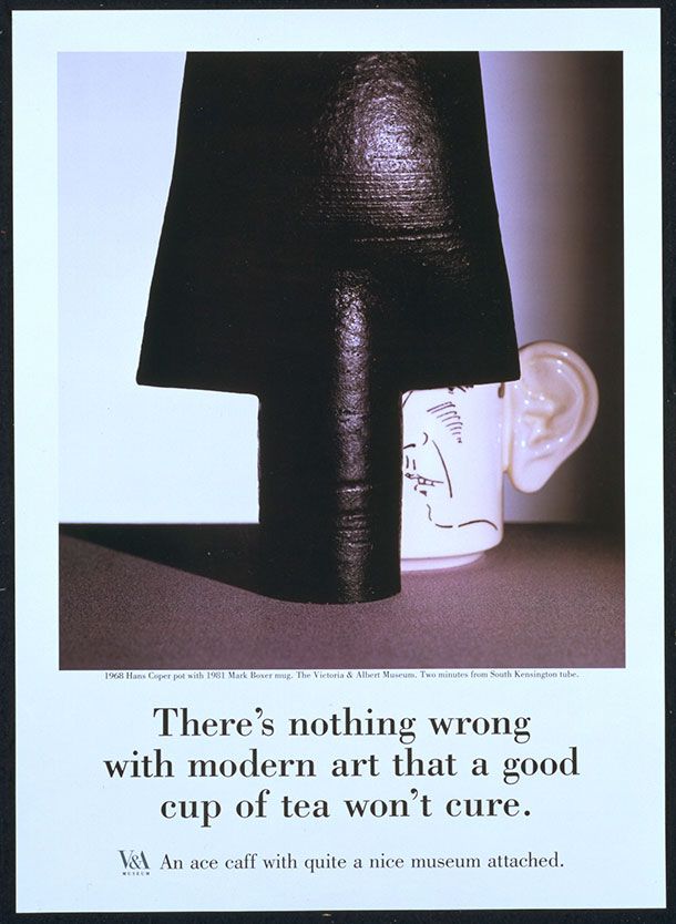
The V&A, one of the great museums of the world, advertised itself back in the late Eighties as ‘an ace caff, with quite a nice museum attached’. This slogan, dreamt up by the mighty minds of Saatchi & Saatchi, caused a bit of a stir, with many feeling it demeaned the institution and its treasures. The fact is, however, that an ‘ace caff’ was central to the original conception of the South Kensington Museum (as it then was).
Poster, Saatchi & Saatchi Garland Compton Ltd. late 1980s. Museum no. E.513-1988. © Victoria and Albert Museum, London.
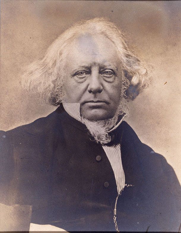
Henry Cole, the first director of the museum, and its first architect, Captain Francis Fowke, began to realise their vision of a great centre for the arts and crafts, with new art schools, a grand lecture theatre and display galleries, in the 1860s - and the Refreshment Rooms (i.e. the ‘caff’) were a vital part of their conception. The Gamble Room (named after a member of the museum’s design team), the largest and grandest of the three interlinked refreshment rooms, was deliberately placed so that it would be the first thing visitors saw as they came in through the main entrance (this original entrance front is now the North side of the inner quadrangle, the Madejski Garden). And it must have struck them as altogether extraordinary.
Sir Henry Cole, photograph, unknown photographer, about 1858 - 1873. Museum no. E.207-2005. © Victoria and Albert Museum, London
With all three of the original refreshment rooms now restored to their full glory, we can imagine something of the impact they must have had on early visitors to the museum.
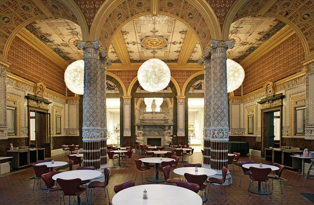
The Gamble Room
Gamble Room -- © Victoria and Albert Museum London
The lofty, Italianate Gamble Room represents Victorian design at its most opulent, eclectic and unrestrained – every surface patterned, gilded, painted, illustrated, inscribed, all bright and brash and hugely self-confident. A massive Baroque chimneypiece dominates one wall, while the rest is all covered with decorated ceramic tiles. Ornate majolica columns support the arches leading into the apsidal North wall of the great room, which is pierced by tall windows of painted glass. The high Victorian compulsion to spell everything out is exemplified by the quotation from Ecclesiastes that runs all the way round the frieze – ‘There is nothing better for a man than that he should eat and drink, and make his soul enjoy the good of his labour’. In a similar spirit, the windows are liberally covered with proverbs, maxims and literary quotations, all extolling the pleasures of eating and drinking. Yes, this magnificent interior was indeed a place for eating and drinking – the world’s first museum restaurant. And, like the rest of the museum, it was artificially lit – another first for a museum. This lighting was essential to the museum’s educational purpose, as it enabled working people to visit in the dark London evenings. The original gas jets have long gone, but many of the ornamental gratings that took away the heat and fumes can still be seen, and those in the Gamble Room, heavy and ornate, are especially impressive. They served another practical purpose, too: along with the tiled walls and columns, they made the room effectively fireproof – a major consideration in the days of horse-drawn, inefficient fire engines.
Image credit: Eric Huybrechts.
Now the room is lit by huge filigree spheres dotted with electric bulbs – not exactly in keeping, perhaps, but there’s no need to be prissy in a space like this, where the canons of taste have been cheerfully forgotten in an exuberant display of the sheer joy of decorative surfaces, and of food and drink.
The Morris Room
Morris Room -- © Victoria and Albert Museum London
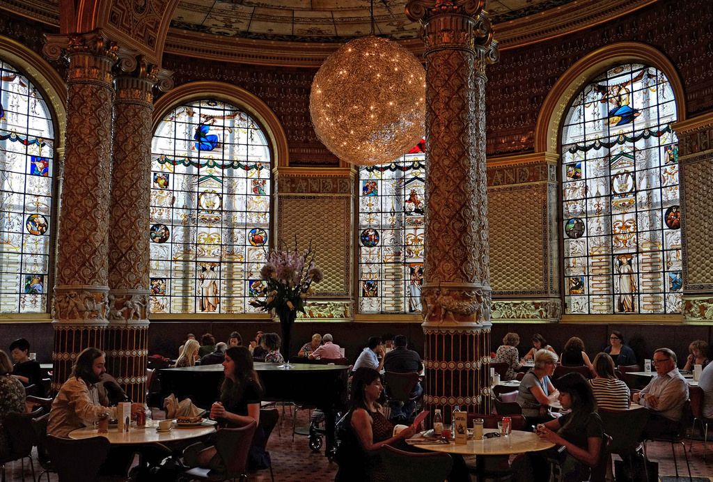
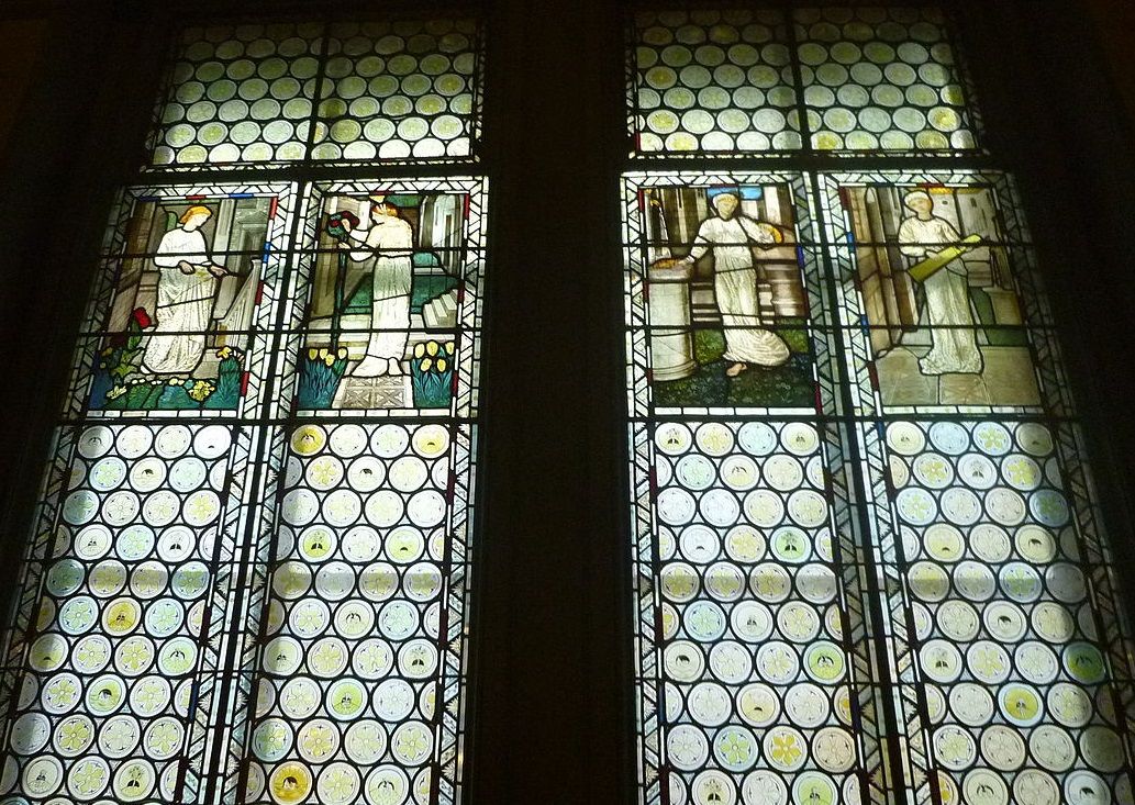
After the bright and gaudy excess of the Gamble Room, the dimly lit Morris Room, which opens onto it from the West, comes as quite a shock. It was consciously intended to contrast with the Gamble Room, and with the room to the East, the Poynter Room, as Henry Cole’s intention was to use these three refreshment rooms to illustrate the whole range of contemporary interior design. They offered – and offer – the attentive visitor a kind of conspectus of high Victorian taste. Cole himself was not a fan of William Morris, but he recognised his importance and his originality, and trusted Morris’s company with this important interior, its first major work. Subdued shades of green predominate in this restful room, with a raised pattern of leaves, flowers and berries – very William Morris – supplying texture to the walls. Burne-Jones paintings above the dado rail depict plants and figures against a dull gold background. Dogs and hares chase each other around the frieze, under gilded egg-and-dart moulding, and the ceiling is quietly patterned in ochre.
Image credit: Love Art Nouveau via Creative Commons
Stained-glass windows, with medieval-style Burne-Jones figures above jolly, cartoon-like little roundels, let in a suitably dim light. Rather amazingly, contemporary critics described the effect as ‘Tudor’ – but then, this look would have been quite new to many of them.
The Poynter Room
Poynter Room
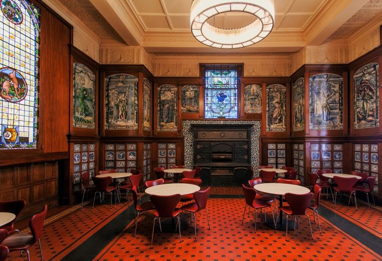
The third room - the Poynter Room, designed by the eminent artist Edward Poynter - is again different from both the other two. Blue Dutch tiles here predominate, many of them painted with landscapes, classical figures, stylised flowers and ships, under large tiled pictures of the months and seasons. The effect is surprisingly heavy – very different from the more delicate use of blue-and-white tiles and ceramics later in the century. This heaviness is lightened somewhat by the painted-glass windows and by the white plasterwork friezes decorated with peacock motifs – a clear sign of oriental influence, as are some of the flower patterns on the tiles. Around the stove – which survives in its original form, though no longer in use – are sunflower-pattern tiles that look forward to the Aesthetic period.
Etching of the Poynter Room by John Watkins, c. 1876-81. © Victoria and Albert Museum, London.
The Poynter Room was originally the Grill Room, fitted out to ‘broil chops and steaks’. Here visitors could enjoy such hearty fare as steak puddings, veal cutlets, sausage and mashed potatoes, stewed rabbit and jugged hare. The room opened at 9am for breakfast, cooked by white-hatted chefs on the grand stove. An ace caff, indeed. This remarkable suite of rooms puts other museum cafes in the shade, and it is wonderful that it once again serves its original purpose today – though steak puddings and jugged hares are no longer on the menu.
The V&A Cafe was one of our 10 Most Beautiful Interiors to have Afternoon Tea. Find out what's currently on the menu and plan your visit here: www.vam.ac.uk/info/va-cafe


