We talk to the brilliant and bold interior designer Siobhan Hayles about styling, lighting and being brave about colour and pattern...
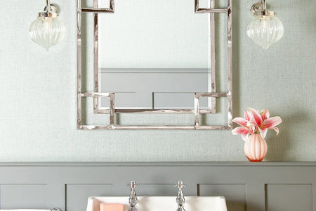
Westcountry-based stylist and interior designer Siobhan Hayles isn't afraid to make a statement in a room - as a browse of her website portfolio will attest. From decadent gilded bathrooms you'd like to spend all day soaking in, to macho mancaves complete with animal skins and motorbikes, she's pretty fearless. She also likes to use a Pooky lamp and shade or two, so naturally we thought we'd have a chat with her and find out where she gets her inspiration from. Here's our Q&A... How would you describe your interior design style? My design style is changeable! I love using new colours, patterns and fabrics and incorporating new trends and I don’t get too attached to one style. I like to work and play with scale and love oversize pieces in a scheme although these tend to be mirrors, lights or works of art.
Bathroom by Siobhan Hayles. Image credit.
Man Cave by Siobhan Hayles. Image credit.
Where do you get your inspiration from?
Everywhere! But I am most inspired by nature, gardens, flowers and the changeable colours on the moors around where I live in Devon. Even in winter they are a great inspiration. Prior to my career in interior design I worked in the travel industry and was lucky enough to travel far and wide. Countries like India really opened up my eyes to the vast palette of colour out there and showed me examples of 'colour bravery' and pairing unexpected colours, like red and pink or blue and black.
How does lighting play a part in your interiors?
Lighting is hugely important when designing a room. First off - practical light has to be thought about and correctly installed. I like to use sunken LED ceiling fittings which can be painted in with the ceiling colour, which by the way doesn’t have to be white! I am a big fan of painting the ceiling the same colour as the walls or going darker for a 'cocooning' vibe.
Moody living room complete with gold mirror ball. Image credit.
I always like to have lights on dimmer switches so that you can control the amount of light for the time of year. In winter we need so much more artificial warm light than summer. Once you have your overhead practical light you can dim it down and move onto the fun staff, adding layers and pools of cosy light created from up-lights and domed wall lights or oversize lamps.
What is the style in your own home? Do you have a favourite room?
My home is somewhat a mixture. I have a bright and light Scandinavian style kitchen, a cosy dark living room with sparkly cushions and some very colourful rooms where you are not sure what to look at first - it all just seems to work together somehow. The kitchen is my favourite room in the house as it's where the family spend most of the time - I always have a couch or armchairs in my kitchen so there is a comfy place for friends to sit and sip wine and relax whilst we prepare a meal.
Pops of colour in a townhouse drawing room. Image credit.
We believe mixing and matching colour and pattern can make for some stunning results. Do you have any top tips on how to do this in the home?
I design from the heart, I don’t follow any rules, which I think helps give my scheme some 'guts'. I always try and coax my clients to try something new, be it a dark colour or a big pattern they might usually shy away from. So I would suggest others be brave - try new things. However one safe and easy tip to try is to use tones of the same colour within a room scheme, from the very bright to the dark, use up to three shades. If doing a living room, for example, use the same shade in the sofa, lampshade and accent paint colour. With pattern you can repeat the same style and colours on different scales. So use a small version of a pattern on a cushion and then echo it on a larger scale on a rug or curtains. Subtle repetition unifies the overall look of the room.

'Find your colour bravery'! - Image credit.
Finally we’ve got to ask you , what is your favourite Pooky light and why?
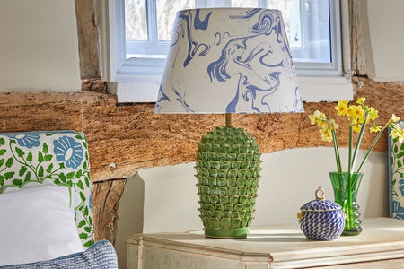
This is a tricky one to answer as I love the whole Pooky brand! I have used the same large straight empire zig zag Ikat lampshades in various bright colours in different projects.
Pooky's Ikat pattern shades add colour and character. Image credits.
For an oversize statement they look great on the Trixie base (above), but for my next project a converted mill I am looking forward to using the Herbert table lamp, which is a green marble that is bang on the forest green trend that is so in at the moment. From a practical point of view I look forward to using the new colour match service for lamp bases that will make blending interior schemes so much easier.
Herbert table lamp in green marble - shop here
You can see more of Siobhan's work on her website, and follow her on Instagram. And you can get lots more interior design inspiration on our blog.


